︎︎
NEWA:
Website Redesign Recommendations
User research, front-end design suggestions, and mockups for the Network for Environment and Weather Applications
Purpose
During my time as a Masters Student, I completed a capstone project with fellow classmates Lola, Masha, and Yitong. We conducted UX research and provided design recommendations for the Network for Environment and Weather Applications (NEWA) website. The NEWA website delivers critical crop management information and data through pest and disease models, which growers across the country use to inform their farming decisions.
The current problem with the NEWA website is its unresponsive design and cluttered interface. NEWA has many resources and external links that can be confusing to users. NEWA is an information heavy website, as it accommodates users that grow a variety of different crops in a variety of geographic locations. Given this intense scope of data, users tend to get lost and discouraged from exploring the features that are relevant to them.
The goals of this project were to continue primary user interviews for NEWA, use relevant UX methods for research and analysis to gather usability data, and to summarize the findings of this research and data collection by providing responsive web design recommendations. To address these problems and goals, we engaged in an iterative, user-centric design process. This included a series of prototypes and user feedback sessions.
Contextual Interviews: INTERVIEW I
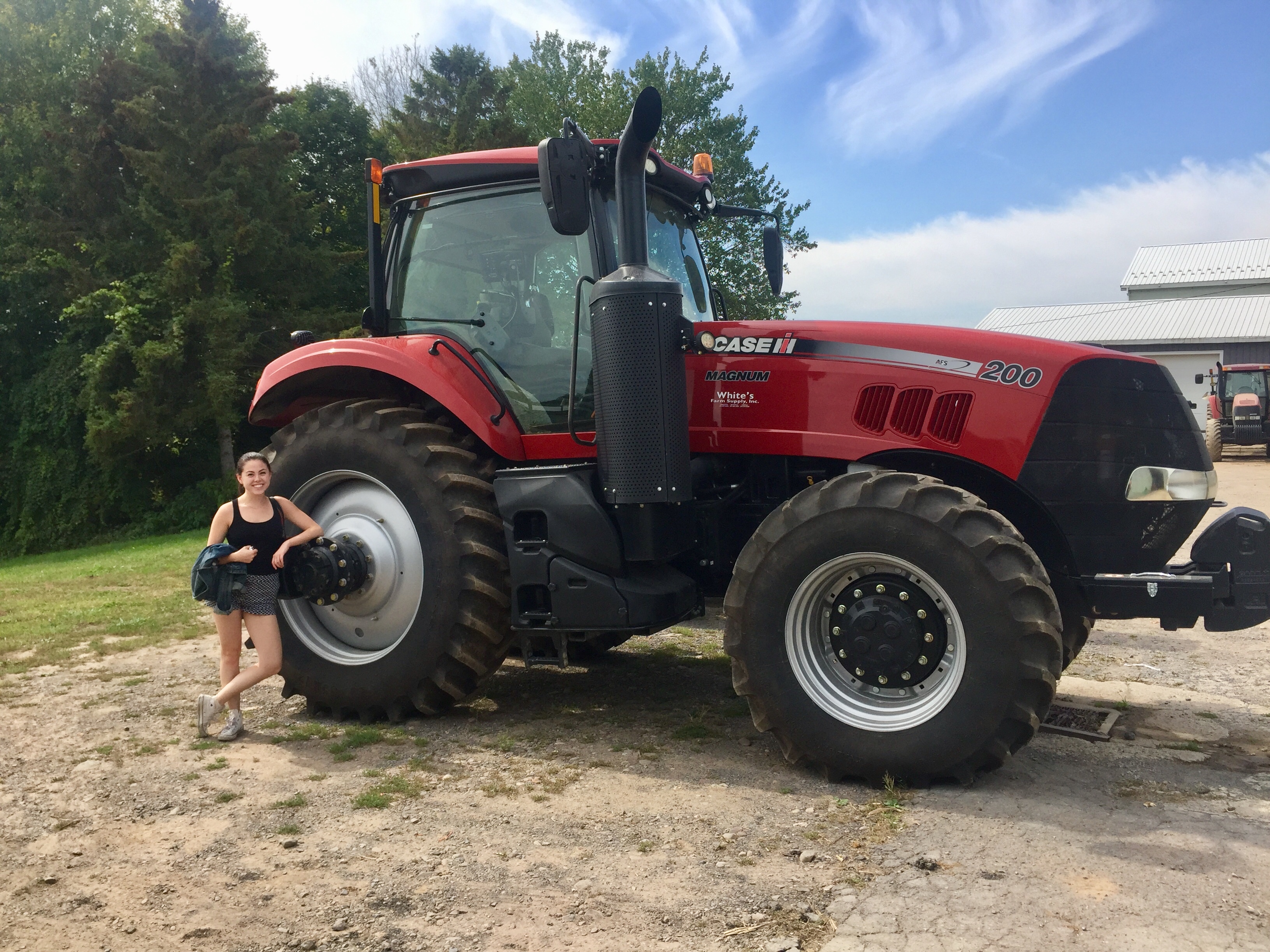
We met with farmers around New York State to learn more about what they do and how they use NEWA. We started by asking general background information, followed by more specific, NEWA-based questions. We were interested in seeing the types of tasks farmers use NEWA for, and how they complete these tasks using the website.
Through these interviews, we discovered three reoccuring themes:
Navigation: Users found it difficult to quickly and directly navigate to their pages of interest. Most of our primary users are interested in specific models for specific weather stations. In the existing website design, users must access multiple tabs and subtabs before reaching their desired page, making navigation lengthy and unintuitive.
Customization: Users found it time-consuming to re-enter their data into the models every time they visited the NEWA website to get updated information. In order to better acquire and retain users, the burden of monitoring data should be transferred from the user to the site itself.
Centralization: Users needed to navigate to a variety of locations on the website in order to obtain the information they were looking for. This made using the current NEWA website time-consuming.
Example of the current NEWA website, with problem areas highlighted in yellow.
We used these themes to come up with requirements. Writing requirement statements allowed us to have a clearer understanding of how to prototype moving forward. Examples of some of our requirement statements were as follows:
Name: Personalized profiles
Theme: Customization
Description: The website should have personalized profile that remembers/displays a user’s specific models.
Name: Home page
Theme: Navigation
Description: The website should have an effective home page with an option to log in or make an account clearly visible.
Name: Help page
Theme: Help
Description: Help page with FAQs and video tutorials.

Photo of a group meeting! Learning about pest management with apples.
Low Fidelity Mockups
Using our Interview I analysis as a guideline, we decided to focus on prototyping the following pages/features:
Create Your Profile
Profile
Help Page
Nav Bar
Profile
Help Page
Nav Bar
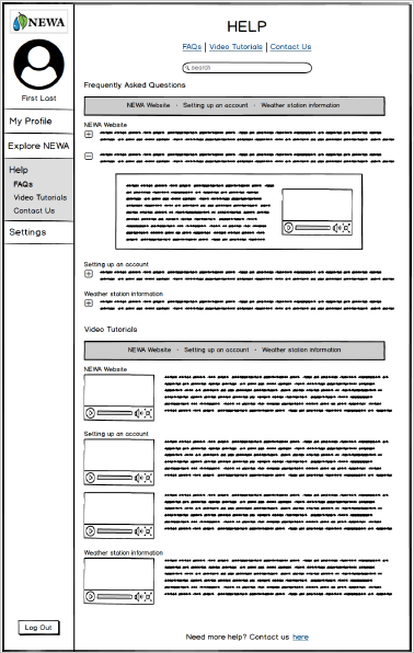
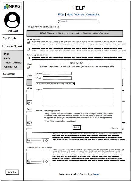
I contributed by creating mockups for the help page. This also included a “contact us” form:
User Testing: INTERVIEW II
After creating low-fidelity mockups, we went back to farmers to conduct usability tests. We started these interviews by asking questions about growers’ NEWA use. We then brought out our prototype and asked participants to complete various tasks.

Snapshot of a usibility test in progress.
After these interviews had been completed, we met as group and went over the key points of the interviews. For example, in the help page we concluded that it would be useful to have categories for types of questions, rather than simply listing them. We used these observations to inform our medium-fideliy wireframes.
Medium Fidelity Mockups
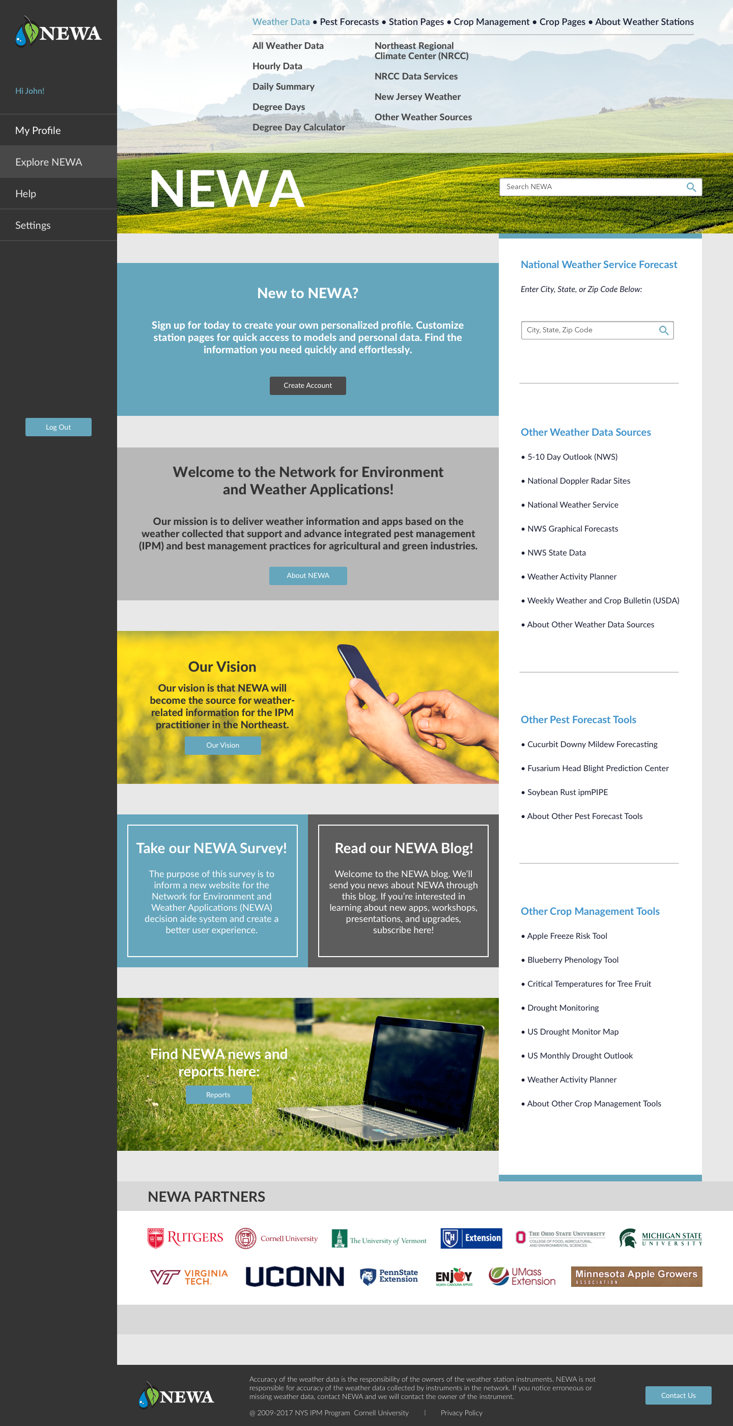
We created medium fidelity wireframes on Balsamiq. In addition to transferring my paper prototypes onto Balsamiq, I also created an “Explore NEWA” page. We added this page because it provided a good visualization for a page non-acount holders could use.

Stakeholder Feedback
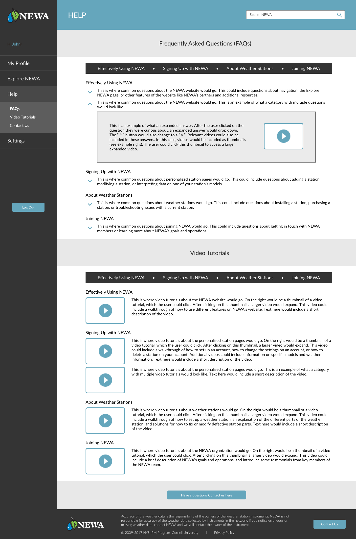
Once we had created our wireframes, we met with two of our stakeholders, Dan and Julie, to discuss our prototypes. Dan was the manager of our project team, and is the current NEWA coordinator. Julie is a NEWA project leader and IPM Coordinator. We went over the various pages we had created and made minor adjustments that were then integrated into our high fidelity mockups. For example, Julie provided me with better FAQ question categories that would be more realistic than the placeholders I was currently using.
High Fidelity Mockups: Version I
We created high-fidelity mockups on Sketch, which we linked using InVision.
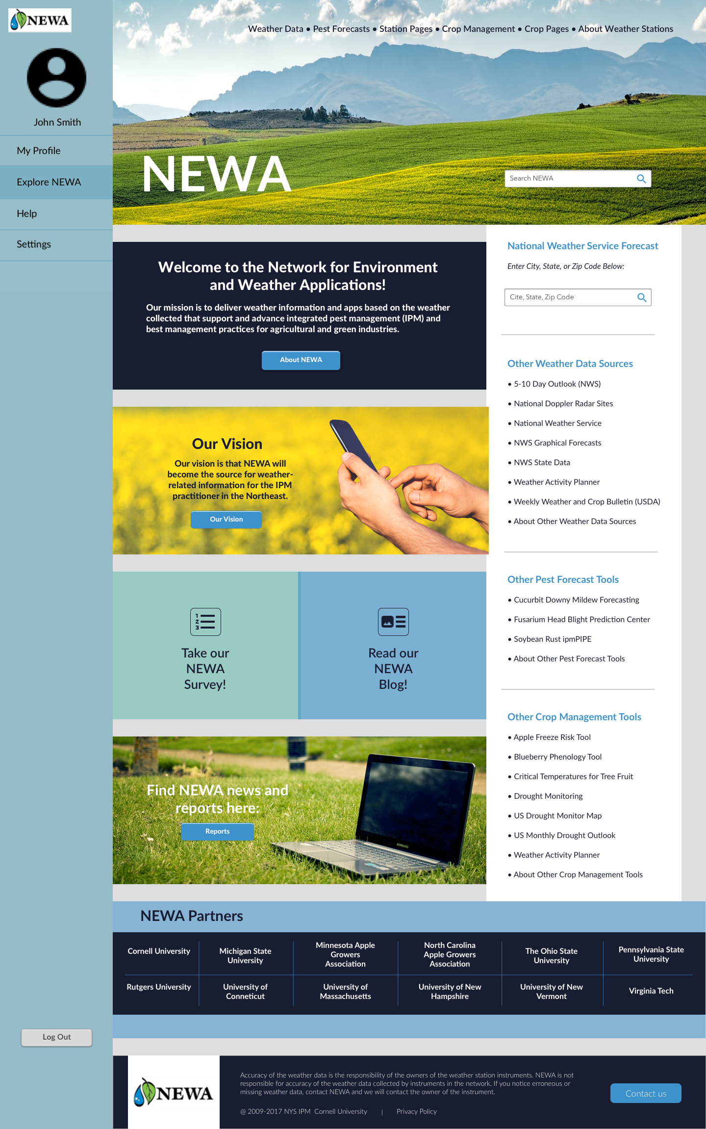
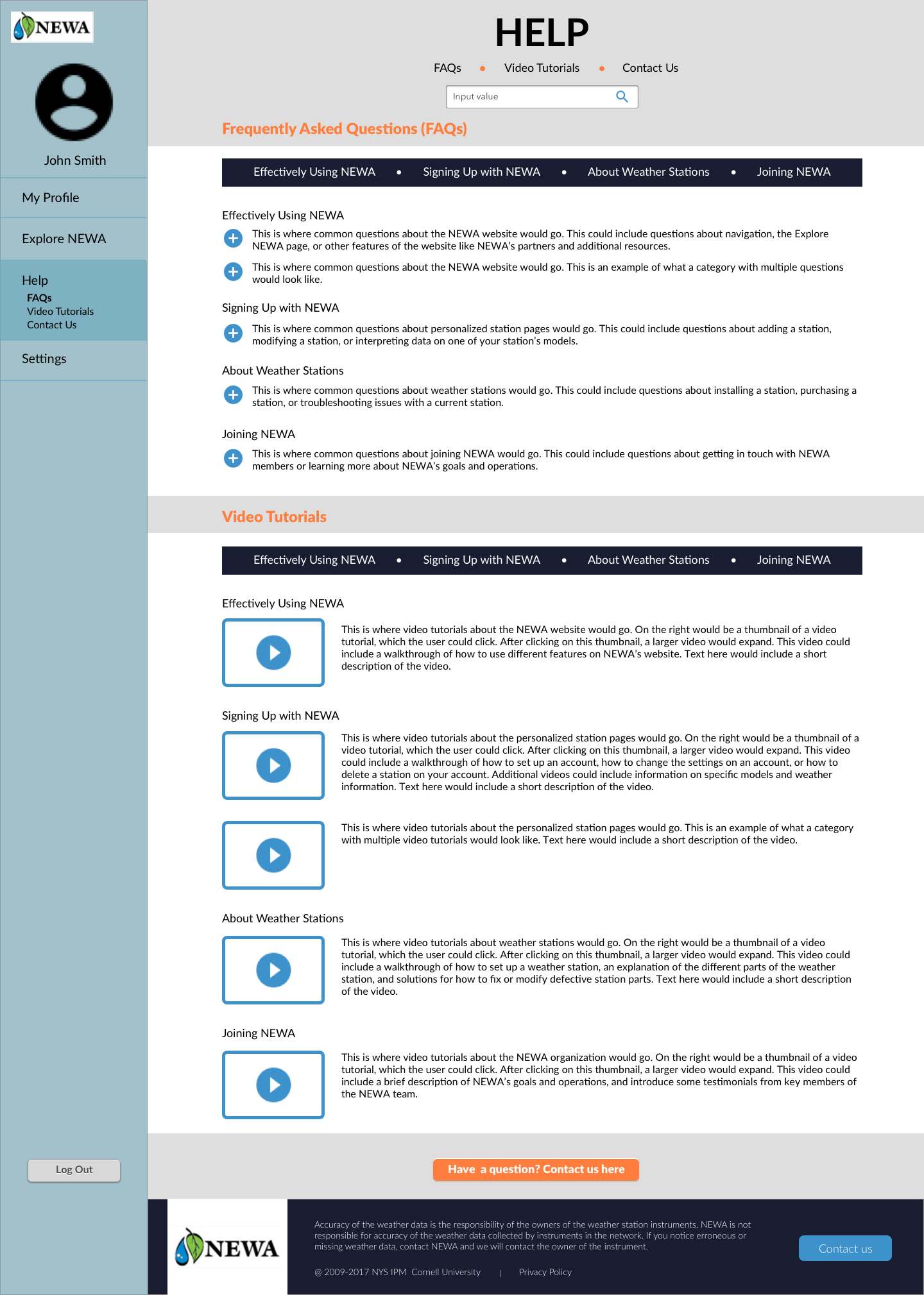
Mockups I helped create.
User Testing: INTERVIEW III
For our final round of interivews, we ran user tests with members of Cornell Cooperative Extension, an agricultural research resource for growers in New York State. While we generally received positive feedback, there were some features we noted that users still wanted, such as a way to export data more easily as a PDF. Participants were also interested in having expandable weather stats. We kept these notes in mind when coming up with our final mockups.
High Fidelity Mockups: Version II
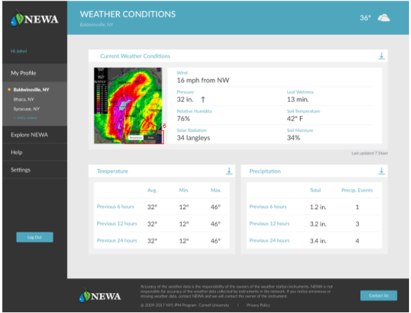
For our final, high fidelity mockups, we fleshed out our design further. I contributed by adding a weather station stats page as well.
Final Design Report
In addition to my own specific contributions, Lola, Masha, and Yitong also created various mockups for other aspects of the site. By combining our mockups, we were able to address the previously mentioned themes as follows:
To address problems with navigation...
We suggest that NEWA switches to a static sidebar menu to improve ease of navigation for users. We suggest that the menu items on the sidebar are My Profile, Saved Stations, Explore NEWA, Help, and Settings.

We suggest that NEWA introduces a user profile system. When users sign up for a NEWA account they will be able to save the station pages and specific models to their profile. When they first log in they will be taken to their dashboard, which will be a screen that summarizes the current weather conditions at their station along with model stats. From this page they will be able to navigate to a weather station stats page and into each model page.

To address problems with centralization...
We suggest that NEWA centralizes all the information to each user so that it is easy to find. As an extension of having user profiles, all user input should be saved. For example, the key crop dates used by different models should be saved on the model pages. Another aspect of centralization is allowing users to set notifications for their station based on certain conditions they want to be alerted about.

The link to our final, high fidelity mockup as linked on InVision can be found here.
Final Thoughts & Contributions
This project was important because it allowed me to improve my prototyping skills, and practice conducting user experience research in a real-world setting. Our end users were not tech-savy college students, but rather older farmers and growers with little technical experience. This was an important consideration to keep in mind. Our design recommendations needed to be clean, but they also had to be clear and easy to maneuver. In addition, it was vital that the content of the website was clearly evident, as farmers are dependent on this data for farming decisions which ultimately effect their bottom line.
Because I had not personally worked with Balsamiq and Sketch prior to this project, I made sure to get actively involved in creating mockups using these platforms. Doing so allowed me to become better equipped to work with these tools. I was able to learn how to create wireframes and high level prototypes. I was also able to improve my skills on InVision by working to link the myriad of pages involved in this project. Gaining real world and technical experience were awesome benefits of this project!
I also learned how important it is to establish clear deadlines, timelines, and open channels of communications with clients and teammates. Not only did this make the project flow more seamlessly, it made the experience enjoyable for everyone!
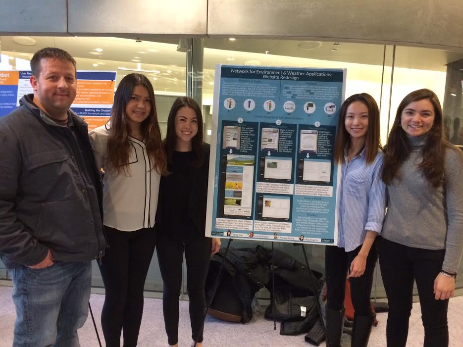
Dan, Lola, Me, Yitong, and Masha, at our poster presentation.
Cargo Collective 2017