︎︎
Navgatr:
Mobility Navigation App
UX design cycle project, resulting in the creation of a front-end prototype to be used by students living with temporary mobility impairments
Purpose
During my Fall 2015 semester, I took a Human-Computer Interaction course that taught students the steps involved in the iterative, user-centered design process. My team members were Stef, Teddy, Michelle and Sunny. We chose to investigate the difficulties that students living with temporary mobility impairments face as they try to navigate around campus. Our goal was to solve problems of accessibility these students may face when trying to navigate new territory on campus. We aimed to find a solution that would help to reduce students’ frustrations and stress, and allow them to traverse campus amongst their peers more comfortably.
Contextual Inquiry: INTERVIEW I
We met with colleagues who met our criteria of students who were currently experiencing temporary mobility impairments while at school, or had previously. We conducted our initial interviews on campus, as this was a real world setting where participants would feel comfortable and be able to talk freely. We sought to avoid the artificial constraints of a lab.
During our interviews, we asked students about their experiences traveling around Cornell. We were interested in not only learning more about the specific physical challenges students faced, but also their reactions and emotions from enduring these challenges.
Another aspect of our investigative process was learning about how students interacted with technology. We had students demonstrate using their phones and any specific navigation applications they tended to use.
Affinity Diagrams
Each group member analyzed notes from the interview for which they had been the designated “note taker.” We created sticky notes containing a single key finding in the first-person voice of the interviewee. These notes were then grouped based on broader topics and divided into subcategories.
Affinity Diagram (scroll to view).
Requirements
Based on this information, we were able to identify the key functionalities we wanted to include in our design. This included things such as Route Planning (existence of route planner; accessibility of route planner; adaptability of route planner; route selection) and System Requirements (accounts; performance).
User Personas
After coming up with some of the key requirements we wanted our solution to have, we developed user personas. We constructed primary and secondary personas, making sure to include vivid descriptions and goals for each. These personas were used to inform subsequent design ideas. Our primary persona, Virginia, was an 18 year-old undergraduate who had severely sprained her left ankle while running, and was therefore required to use crutches for three months. We gave her a vivid background, and goals and concerns regarding a product that would aid those living with temporary mobility impairments. For example, “Virginia highly prioritizes arriving at her classes quickly and efficiently, so she absolutely needs a product with accurate travel time measurements, and visuals of optimized routes since she is still relatively new to campus. She also needs the application to have accurate GPS location and orientation that updates in real-time as she is traveling.”
Ideation Phase
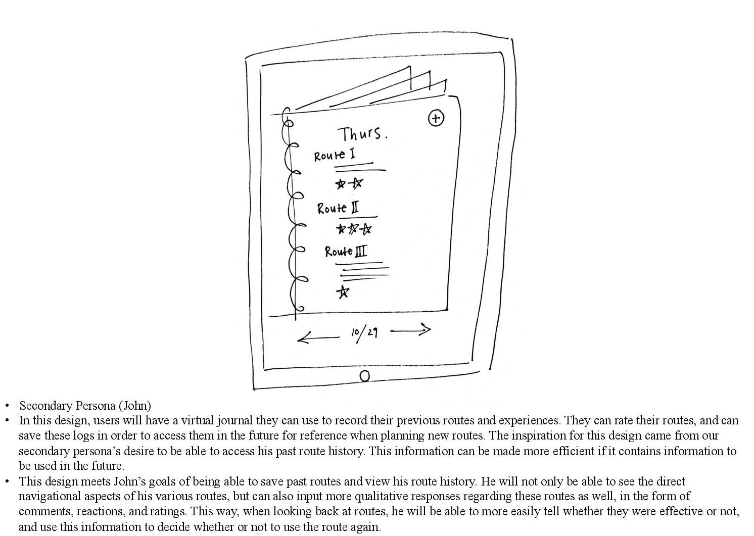
Before meeting as a group, we had individual brainstorming sessions in which we sketched out possible design ideas that would fit the goals and lives of the primary and secondary personas that we had created as a team. Of course, not all ideas ended up being used in our final design, but the whole point was to think outside the box! One example I had, which later sparked the idea of having a user history looked like this:

As a group, we went over our ideas and looked for commonalities that our designs shared. There were five categories that occurred most often in our individual design sketches. By including these themes, the application would address our personas’ most crucial goals and needs:
- An application that allows the user to know the estimated time of arrival from one location to another
- An application that provides up to date information via crowdsourcing
- An application that allows a user to find the optimal path from their desired starting location to their desired destination
- An application that shows transportation that is already provided by Cornell’s campus, mainly CULift and TCAT, and easily allows for integration with your current schedule
- An application that will record the paths you take, and allow the user to easily go back to a path that has already been taken
These themes were illustrated with storyboards, which helped to put them in the context of our personas (scroll to view):
Paper Prototype
After critiquing each others’ ideas, we came up with a paper prototype (scroll to view):
Each page addressed different aspects of our primary and secondary personas. Following this, our prototype was uploaded into InVision to allow for more realistic interactions, viewable here.
Heuristic Evaluation
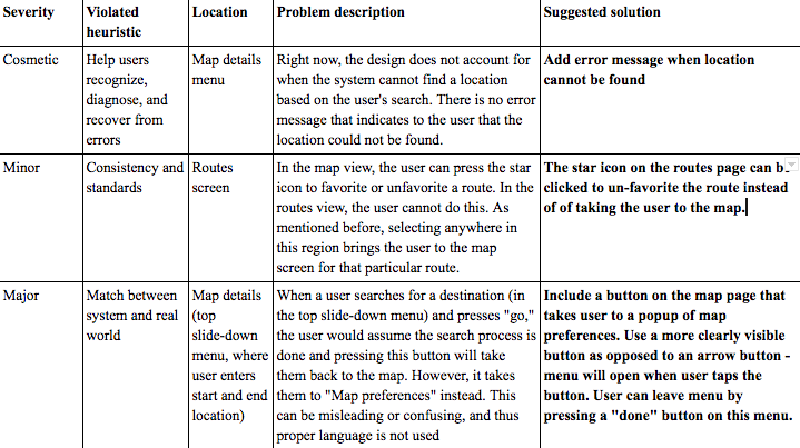
Individually, each group member conducted a heuristic evaluation of our paper prototype, including the violated heuristic, location, and problem description. We then combined these into one large spreadsheet and rated each problem on its severity. We discussed different solutions for each violated heuristic, until we were able to agree on a solution we thought best fit the problem at hand.

Example of heuristic evaluation chart.
Based on this information, we were able to develop a more comprehensive high-fidelity prototype. This was also integrated into InVision, viewable here.
Evaluation: INTERVIEW II
After improving our prototype, we designed a new interview protocol that would take place with our high fidelity prototype. We wanted to see how much ease the participant had in fulfilling these tasks, and if they came across any difficulties when using the app. The feedback from the participants’ interactions with these evaluation tasks gave us insight that allowed us to modify our final design. During the interview, we asked users to “think out loud,” as we wanted participants to explain what they were doing and why. This allowed us to learn more about how users were interacting with our application in real time.
Improved Design
We gathered “critical incidents” from our interviews and compiled these into a list of UX problem instances.
Our top three problem groups (and subsequent design solutions) were as follows. Our final high-fidelity prototype can be found here.
1) The “Feedback” page is too isolated and non-intuitive to find: Users had considerable difficulty locating the “Feedback” page and reporting feedback on a particular location. Many users tried to report feedback via the “Map” page.
Solution: In order to make the feedback functionality more accessible and salient, we integrated “Feedback” into the “Map” page. Users can report feedback via the “Map” page by selecting a point on the map.

Alternatively, users can search for a destination and then report feedback on that destination.

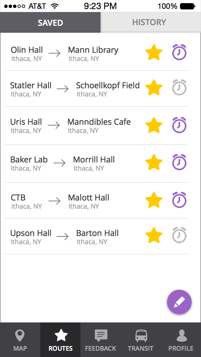
2) The design of the “Routes” screen leads users to have varied expectations on how to “unsave” a route: Users often tried to unsave routes in a variety of ways because of the conflicting signals given by our prototype.
Solution: We removed the icons on the “Routes” page, as users were not interacting with these icons and they only seemed to add to their confusion.
Old Prototype:

New Prototype:

Furthermore, most users assumed that routes could be edited and un-saved by clicking the purple pencil icon at the bottom right of the screen. So, we expanded upon this functionality so that users can now edit, delete, or rearrange saved routes after clicking this icon.

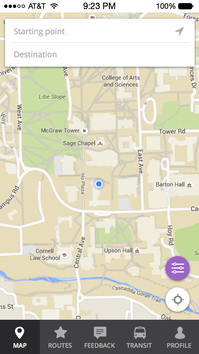
3) Adjusting “Map Preferences” is not a visible feature on the map page: Users can adjust which obstructions show up on the map through the “Map Preferences” menu, which was originally accessed via an icon on the “Map” page. However, many users did not know how to find this “Map Preferences” menu, as there was not a clear natural mapping.
Solution: We implemented a solution that makes this button more salient and the menu more accessible. We changed the design of the button to make it more visible. Now, the button has the words “Map Preferences” in addition to the icon. This button is present on any “Map” page.
Old Prototype

New Prototype

By adding these improvements to our design, it was our hope that our app would be more user-friendly, providing users with a more enjoyable experience characterized by intuitive action and ease-of-use.
Final Thoughts & Contributions
This project helped to introduce me to the user-centered design process, and the importance of continually iterating through prototypes rather than simply sticking with initial designs. By speaking with end users and better understanding their wants and needs, we were able to create a solution that specifically targeted some of their key pain points. In addition, by conducting usability tests and heuristic evaluations, we were able to see where our app failed to match users’ mental models, and consequently improve our design.
Throughout the process, I assisted in coming up with design ideas, and attending/analyzing interviews. I also helped write, format, and proof-read the various milestones to be submitted. I worked on creating the initial paper prototypes we used, and later helped to link our high-fidelity prototype on InVision, among other things. This project made me realize how lively and creative user experience work can be!
Cargo Collective 2017