︎︎
NEWA:
Website Redesign Recommendations
User research, front-end design suggestions, and mockups for the Network for Environment and Weather Applications
Purpose
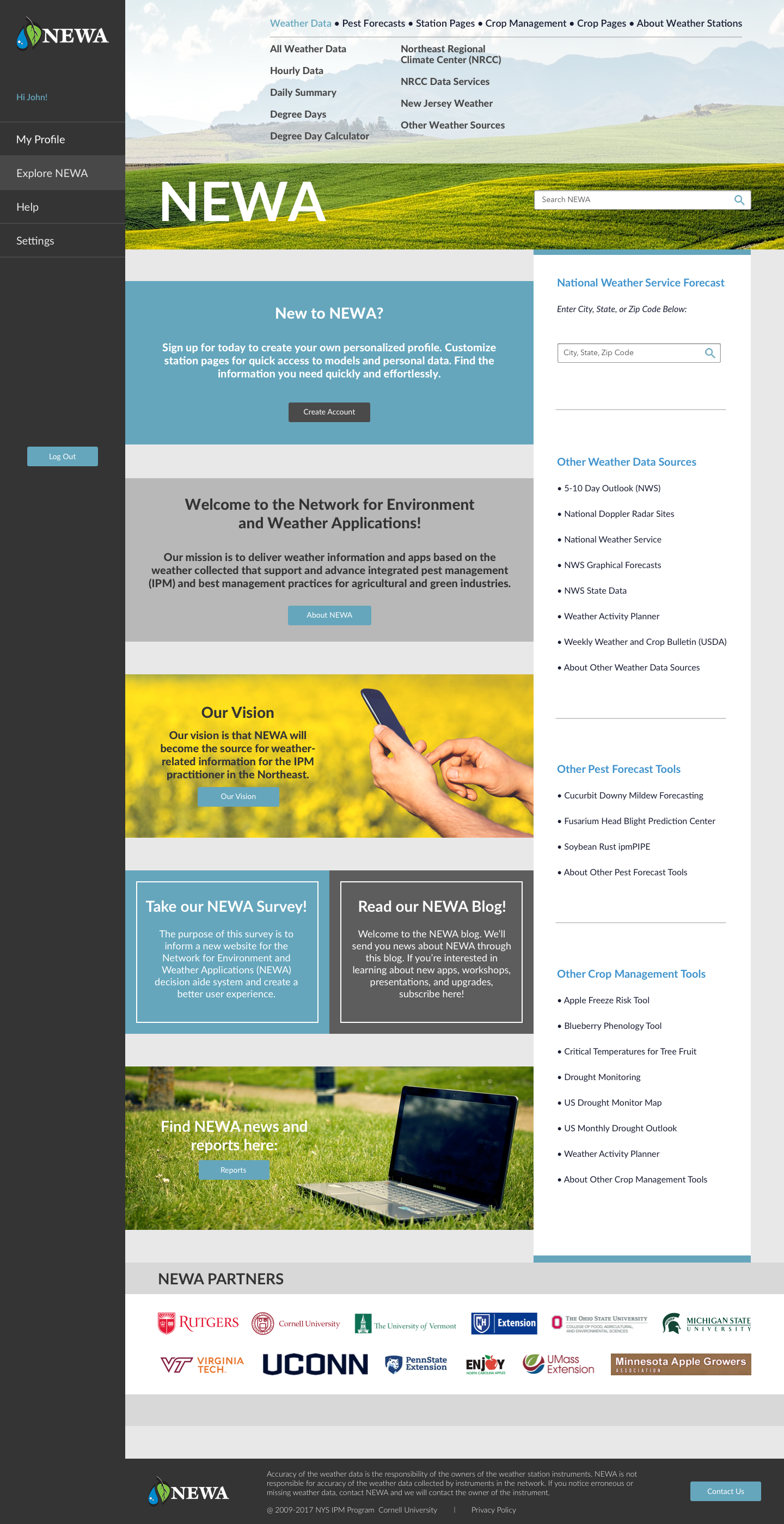
During my time as a Masters Student, I completed a capstone project with fellow classmates Lola, Masha, and Yitong. We conducted UX research and provided design recommendations for the Network for Environment and Weather Applications (NEWA) website. The NEWA website delivers critical crop management information and data through pest and disease models, which growers across the country use to inform their farming decisions.
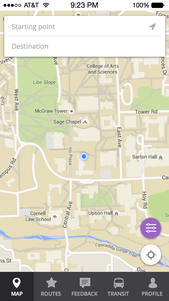
The current problem with the NEWA website is its unresponsive design and cluttered interface. NEWA has many resources and external links that can be confusing to users. NEWA is an information heavy website, as it accommodates users that grow a variety of different crops in a variety of geographic locations. Given this intense scope of data, users tend to get lost and discouraged from exploring the features that are relevant to them.
The goals of this project were to continue primary user interviews for NEWA, use relevant UX methods for research and analysis to gather usability data, and to summarize the findings of this research and data collection by providing responsive web design recommendations. To address these problems and goals, we engaged in an iterative, user-centric design process. This included a series of prototypes and user feedback sessions.
Contextual Interviews: INTERVIEW I
We met with farmers around New York State to learn more about what they do and how they use NEWA. We started by asking general background information, followed by more specific, NEWA-based questions. We were interested in seeing the types of tasks farmers use NEWA for, and how they complete these tasks using the website.

Through these interviews, we discovered three reoccuring themes:
Navigation: Users found it difficult to quickly and directly navigate to their pages of interest. Most of our primary users are interested in specific models for specific weather stations. In the existing website design, users must access multiple tabs and subtabs before reaching their desired page, making navigation lengthy and unintuitive.
Customization: Users found it time-consuming to re-enter their data into the models every time they visited the NEWA website to get updated information. In order to better acquire and retain users, the burden of monitoring data should be transferred from the user to the site itself.
Centralization: Users needed to navigate to a variety of locations on the website in order to obtain the information they were looking for. This made using the current NEWA website time-consuming.


Example of the current NEWA website, with problem areas highlighted in yellow.
We used these themes to come up with requirements. Writing requirement statements allowed us to have a clearer understanding of how to prototype moving forward. Examples of some of our requirement statements were as follows:
Name: Personalized profiles
Theme: Customization
Description: The website should have personalized profile that remembers/displays a user’s specific models.
Name: Home page
Theme: Navigation
Description: The website should have an effective home page with an option to log in or make an account clearly visible.
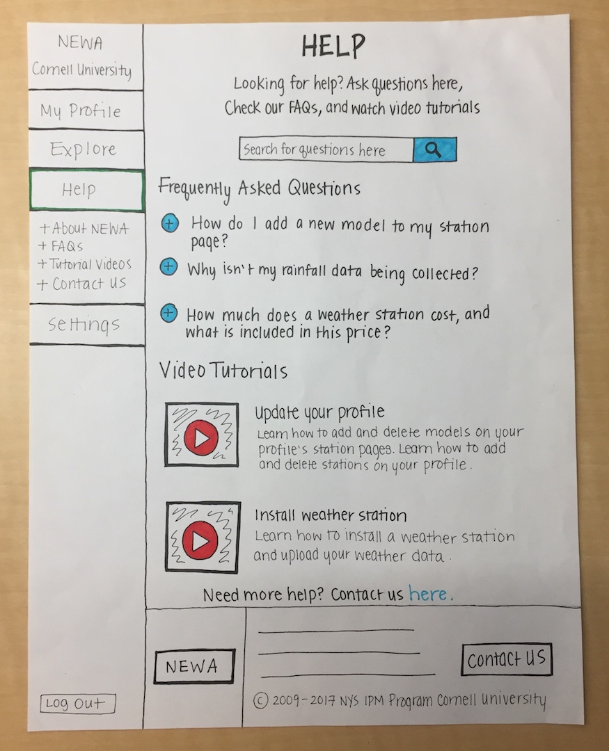
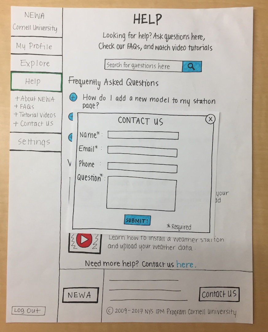
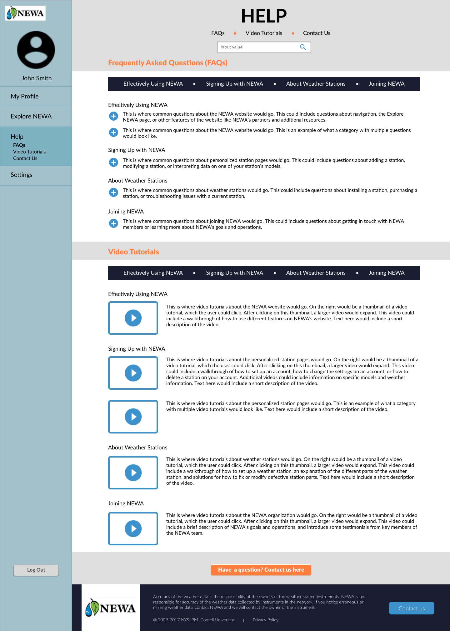
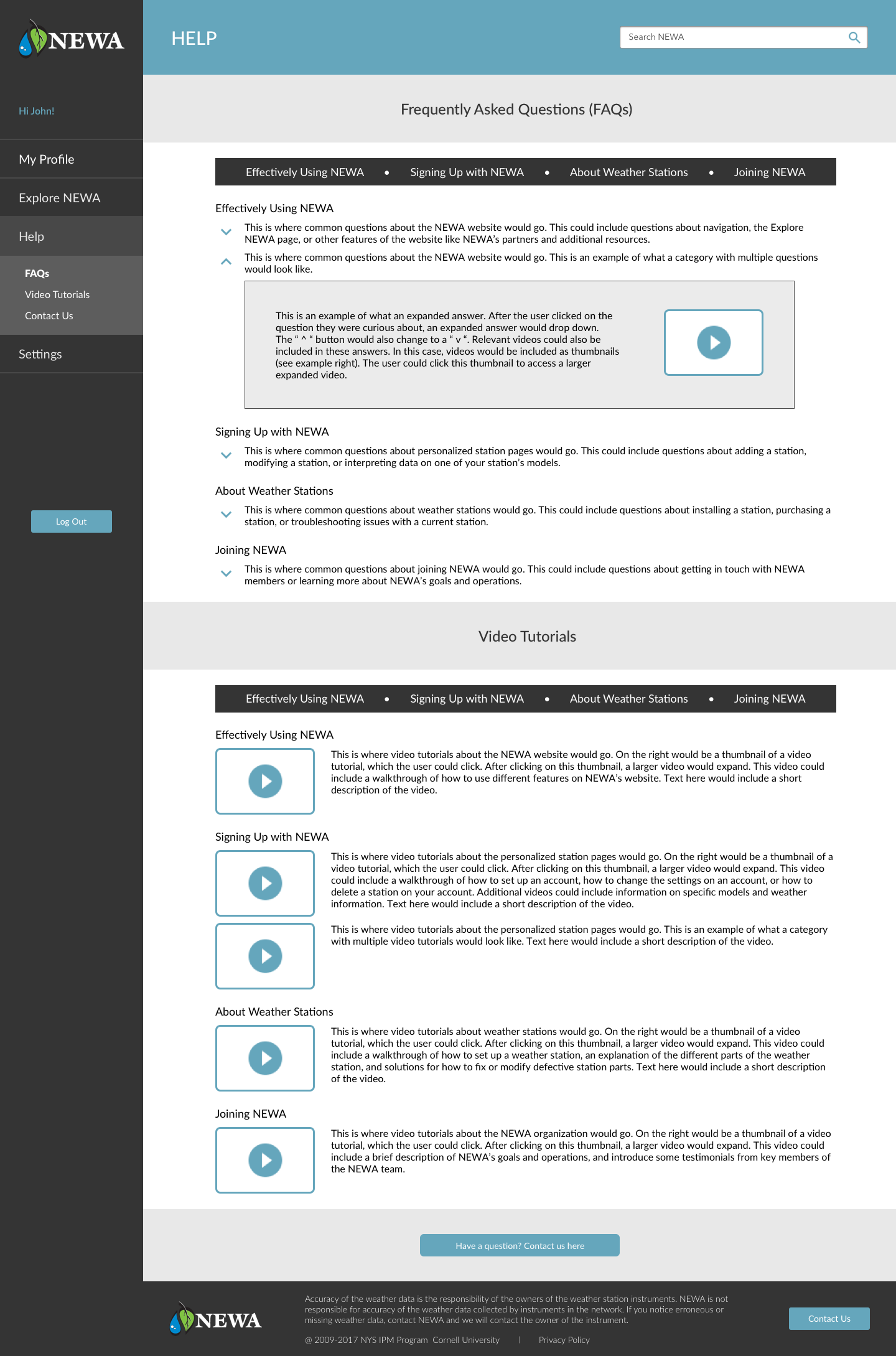
Name: Help page
Theme: Help
Description: Help page with FAQs and video tutorials.

Photo of a group meeting! Learning about pest management with apples.
Low Fidelity Mockups
Using our Interview I analysis as a guideline, we decided to focus on prototyping the following pages/features:
Create Your Profile
Profile
Help Page
Nav Bar
Profile
Help Page
Nav Bar
I contributed by creating mockups for the help page. This also included a “contact us” form:

User Testing: INTERVIEW II
After creating low-fidelity mockups, we went back to farmers to conduct usability tests. We started these interviews by asking questions about growers’ NEWA use. We then brought out our prototype and asked participants to complete various tasks.

Snapshot of a usibility test in progress.
After these interviews had been completed, we met as group and went over the key points of the interviews. For example, in the help page we concluded that it would be useful to have categories for types of questions, rather than simply listing them. We used these observations to inform our medium-fideliy wireframes.
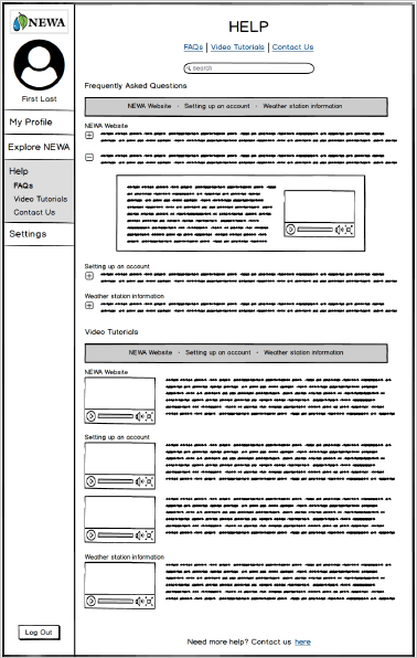
Medium Fidelity Mockups
We created medium fidelity wireframes on Balsamiq. In addition to transferring my paper prototypes onto Balsamiq, I also created an “Explore NEWA” page. We added this page because it provided a good visualization for a page non-acount holders could use.

Stakeholder Feedback
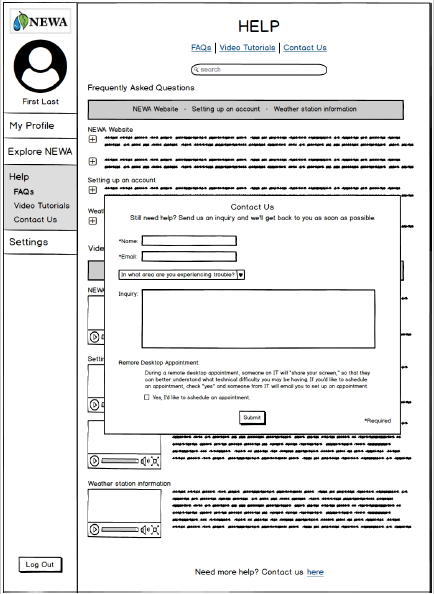
Once we had created our wireframes, we met with two of our stakeholders, Dan and Julie, to discuss our prototypes. Dan was the manager of our project team, and is the current NEWA coordinator. Julie is a NEWA project leader and IPM Coordinator. We went over the various pages we had created and made minor adjustments that were then integrated into our high fidelity mockups. For example, Julie provided me with better FAQ question categories that would be more realistic than the placeholders I was currently using.
High Fidelity Mockups: Version I
We created high-fidelity mockups on Sketch, which we linked using InVision.
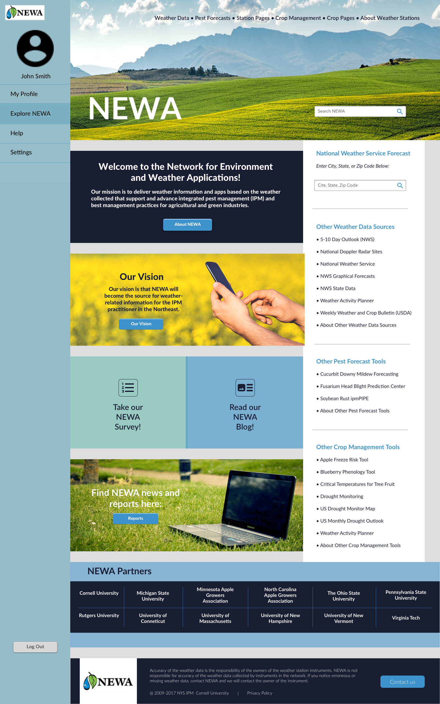
Mockups I helped create.
User Testing: INTERVIEW III
For our final round of interivews, we ran user tests with members of Cornell Cooperative Extension, an agricultural research resource for growers in New York State. While we generally received positive feedback, there were some features we noted that users still wanted, such as a way to export data more easily as a PDF. Participants were also interested in having expandable weather stats. We kept these notes in mind when coming up with our final mockups.
High Fidelity Mockups: Version II
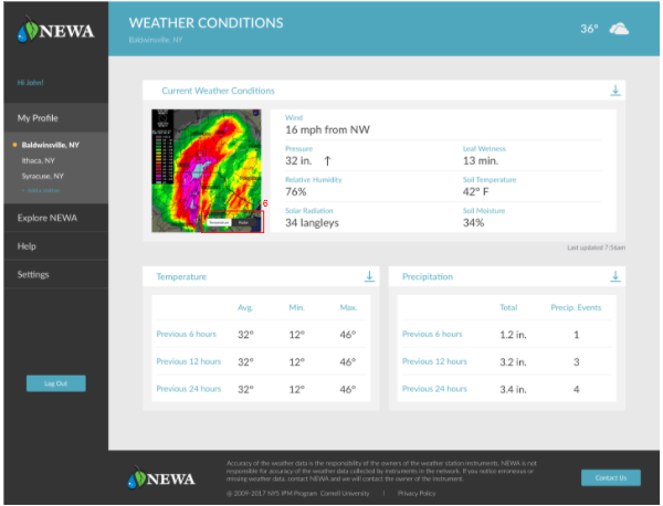
For our final, high fidelity mockups, we fleshed out our design further. I contributed by adding a weather station stats page as well.
Final Design Report
In addition to my own specific contributions, Lola, Masha, and Yitong also created various mockups for other aspects of the site. By combining our mockups, we were able to address the previously mentioned themes as follows:
To address problems with navigation...
We suggest that NEWA switches to a static sidebar menu to improve ease of navigation for users. We suggest that the menu items on the sidebar are My Profile, Saved Stations, Explore NEWA, Help, and Settings.

We suggest that NEWA introduces a user profile system. When users sign up for a NEWA account they will be able to save the station pages and specific models to their profile. When they first log in they will be taken to their dashboard, which will be a screen that summarizes the current weather conditions at their station along with model stats. From this page they will be able to navigate to a weather station stats page and into each model page.

To address problems with centralization...
We suggest that NEWA centralizes all the information to each user so that it is easy to find. As an extension of having user profiles, all user input should be saved. For example, the key crop dates used by different models should be saved on the model pages. Another aspect of centralization is allowing users to set notifications for their station based on certain conditions they want to be alerted about.

The link to our final, high fidelity mockup as linked on InVision can be found here.
Final Thoughts & Contributions
This project was important because it allowed me to improve my prototyping skills, and practice conducting user experience research in a real-world setting. Our end users were not tech-savy college students, but rather older farmers and growers with little technical experience. This was an important consideration to keep in mind. Our design recommendations needed to be clean, but they also had to be clear and easy to maneuver. In addition, it was vital that the content of the website was clearly evident, as farmers are dependent on this data for farming decisions which ultimately effect their bottom line.
Because I had not personally worked with Balsamiq and Sketch prior to this project, I made sure to get actively involved in creating mockups using these platforms. Doing so allowed me to become better equipped to work with these tools. I was able to learn how to create wireframes and high level prototypes. I was also able to improve my skills on InVision by working to link the myriad of pages involved in this project. Gaining real world and technical experience were awesome benefits of this project!
I also learned how important it is to establish clear deadlines, timelines, and open channels of communications with clients and teammates. Not only did this make the project flow more seamlessly, it made the experience enjoyable for everyone!
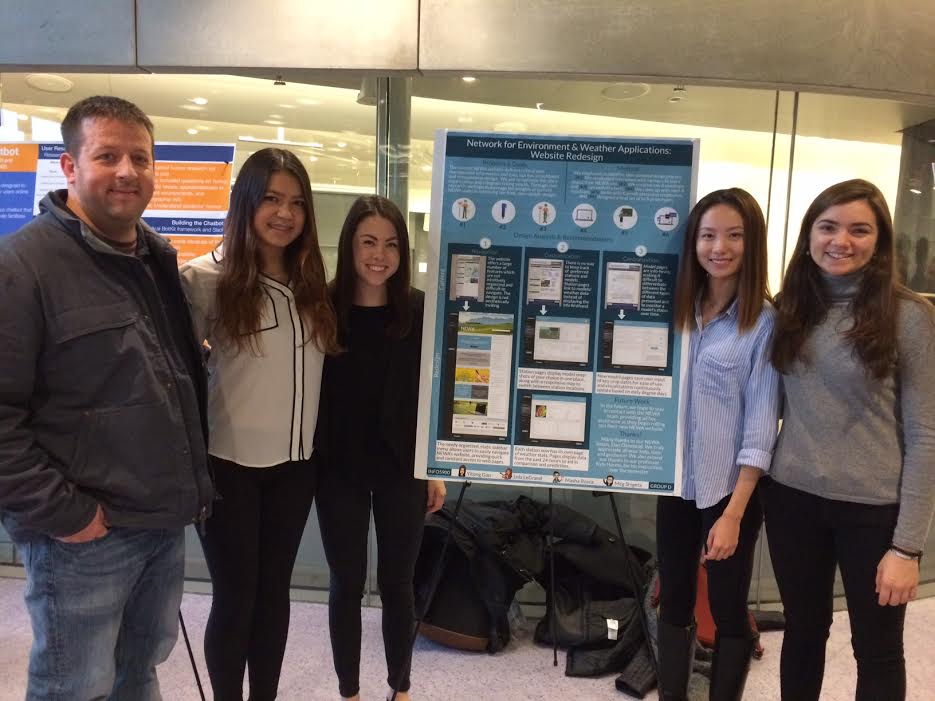
Dan, Lola, Me, Yitong, and Masha, at our poster presentation.
︎︎
Navgatr:
Mobility Navigation App
UX design cycle project, resulting in the creation of a front-end prototype to be used by students living with temporary mobility impairments
Purpose
During my Fall 2015 semester, I took a Human-Computer Interaction course that taught students the steps involved in the iterative, user-centered design process. My team members were Stef, Teddy, Michelle and Sunny. We chose to investigate the difficulties that students living with temporary mobility impairments face as they try to navigate around campus. Our goal was to solve problems of accessibility these students may face when trying to navigate new territory on campus. We aimed to find a solution that would help to reduce students’ frustrations and stress, and allow them to traverse campus amongst their peers more comfortably.
Contextual Inquiry: INTERVIEW I
We met with colleagues who met our criteria of students who were currently experiencing temporary mobility impairments while at school, or had previously. We conducted our initial interviews on campus, as this was a real world setting where participants would feel comfortable and be able to talk freely. We sought to avoid the artificial constraints of a lab.
During our interviews, we asked students about their experiences traveling around Cornell. We were interested in not only learning more about the specific physical challenges students faced, but also their reactions and emotions from enduring these challenges.
Another aspect of our investigative process was learning about how students interacted with technology. We had students demonstrate using their phones and any specific navigation applications they tended to use.
Affinity Diagrams
Each group member analyzed notes from the interview for which they had been the designated “note taker.” We created sticky notes containing a single key finding in the first-person voice of the interviewee. These notes were then grouped based on broader topics and divided into subcategories.


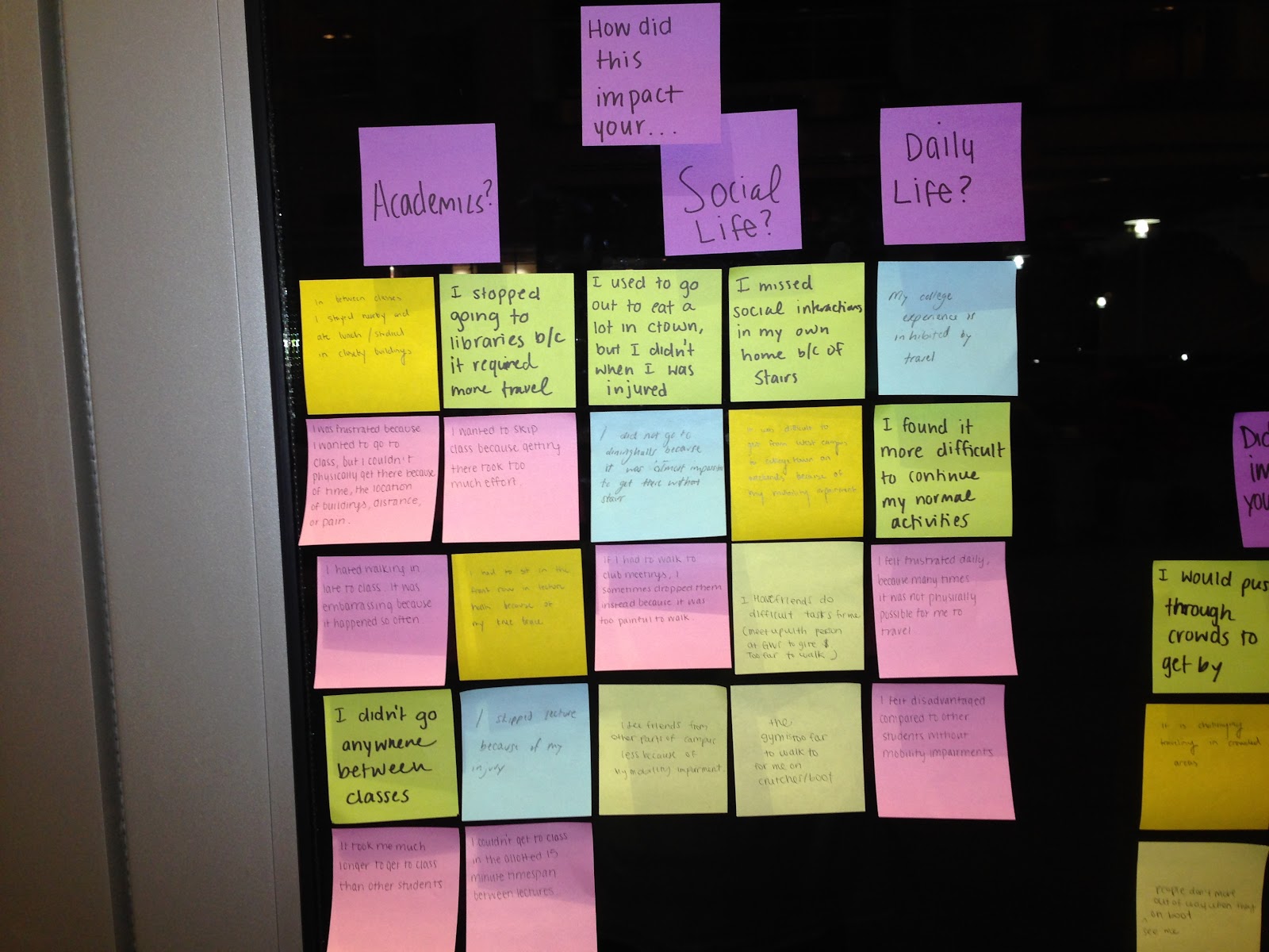
Affinity Diagram (scroll to view).
Requirements
Based on this information, we were able to identify the key functionalities we wanted to include in our design. This included things such as Route Planning (existence of route planner; accessibility of route planner; adaptability of route planner; route selection) and System Requirements (accounts; performance).
User Personas
After coming up with some of the key requirements we wanted our solution to have, we developed user personas. We constructed primary and secondary personas, making sure to include vivid descriptions and goals for each. These personas were used to inform subsequent design ideas. Our primary persona, Virginia, was an 18 year-old undergraduate who had severely sprained her left ankle while running, and was therefore required to use crutches for three months. We gave her a vivid background, and goals and concerns regarding a product that would aid those living with temporary mobility impairments. For example, “Virginia highly prioritizes arriving at her classes quickly and efficiently, so she absolutely needs a product with accurate travel time measurements, and visuals of optimized routes since she is still relatively new to campus. She also needs the application to have accurate GPS location and orientation that updates in real-time as she is traveling.”
Ideation Phase
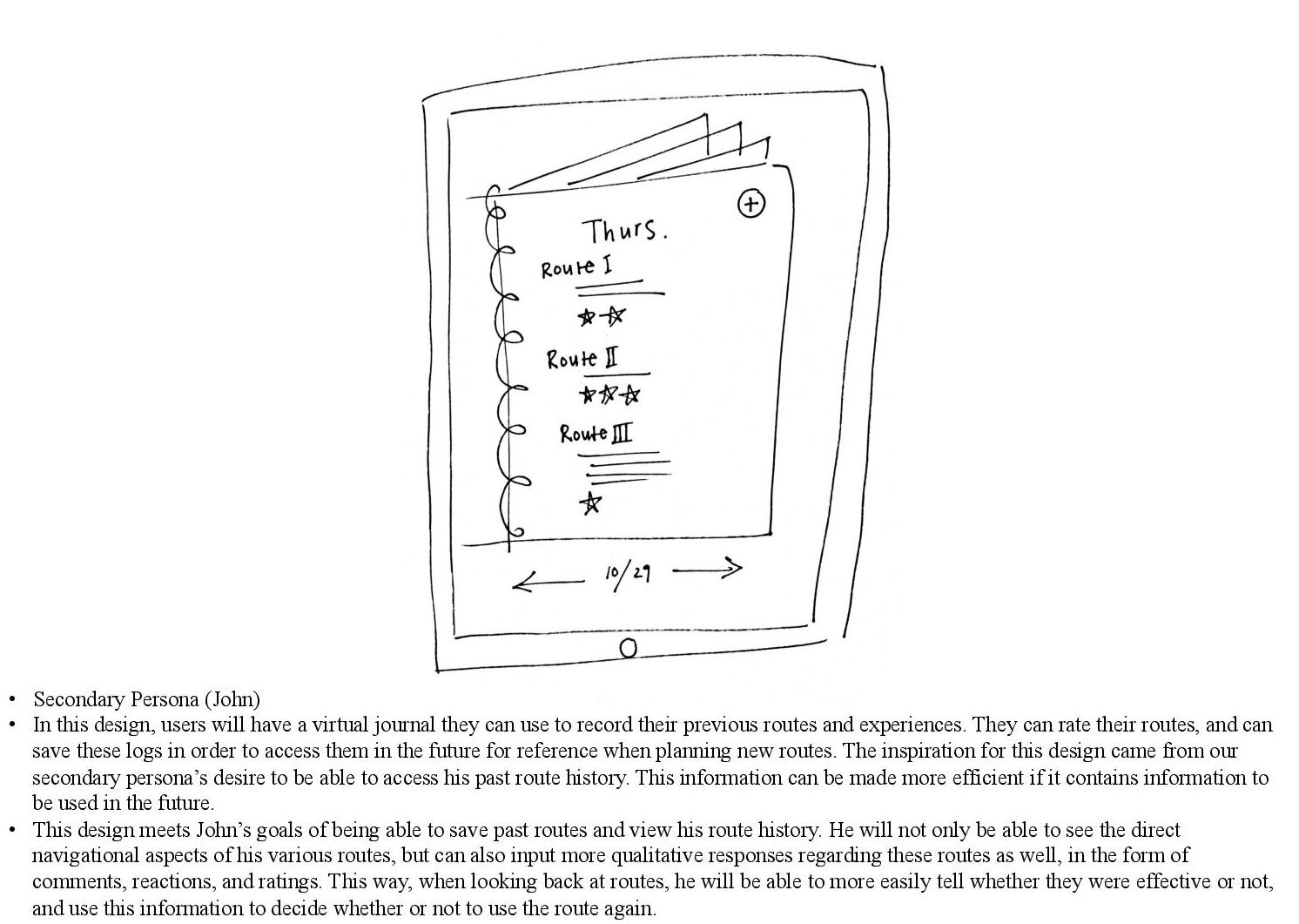
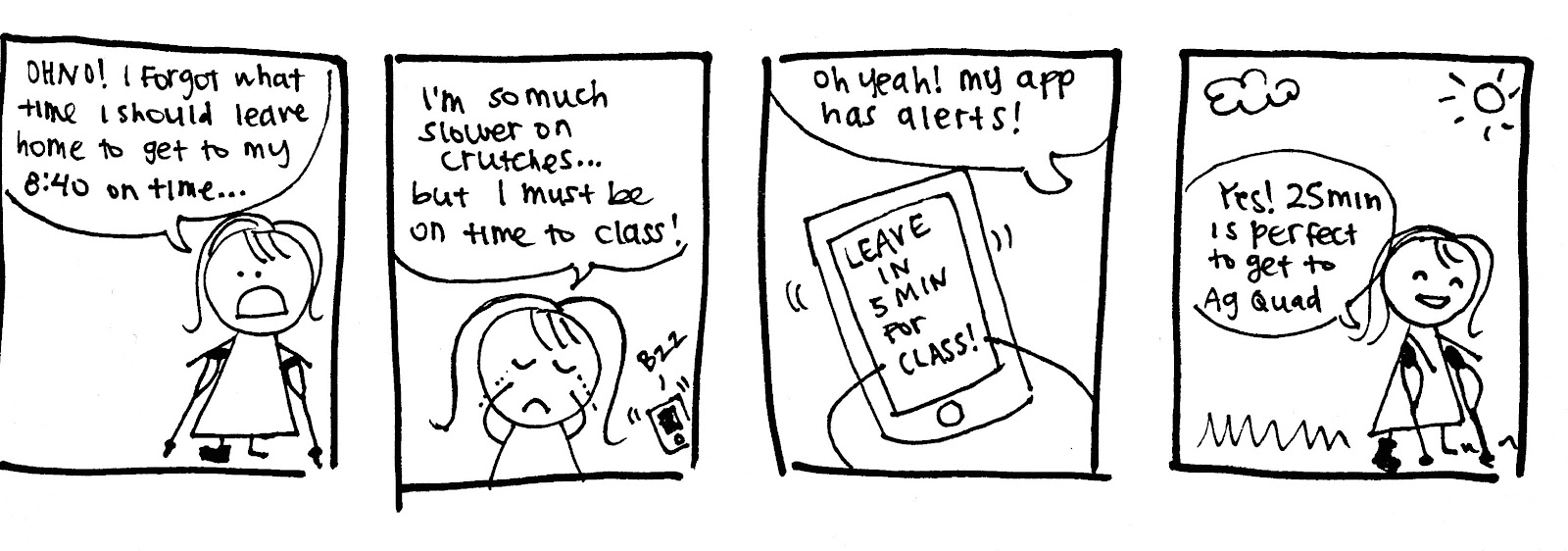
Before meeting as a group, we had individual brainstorming sessions in which we sketched out possible design ideas that would fit the goals and lives of the primary and secondary personas that we had created as a team. Of course, not all ideas ended up being used in our final design, but the whole point was to think outside the box! One example I had, which later sparked the idea of having a user history looked like this:
As a group, we went over our ideas and looked for commonalities that our designs shared. There were five categories that occurred most often in our individual design sketches. By including these themes, the application would address our personas’ most crucial goals and needs:
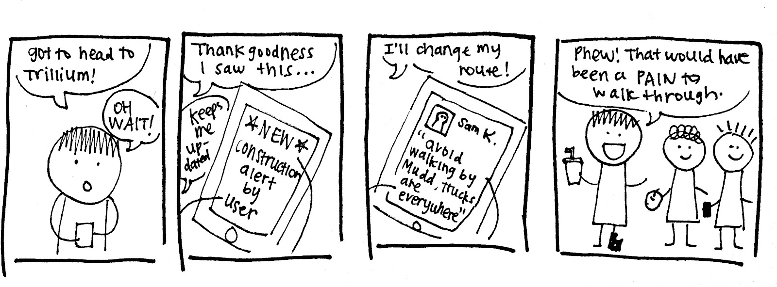
- An application that allows the user to know the estimated time of arrival from one location to another
- An application that provides up to date information via crowdsourcing
- An application that allows a user to find the optimal path from their desired starting location to their desired destination
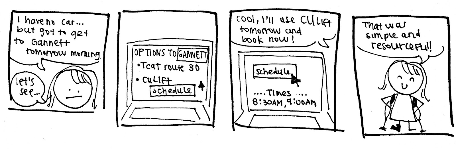
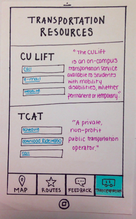
- An application that shows transportation that is already provided by Cornell’s campus, mainly CULift and TCAT, and easily allows for integration with your current schedule
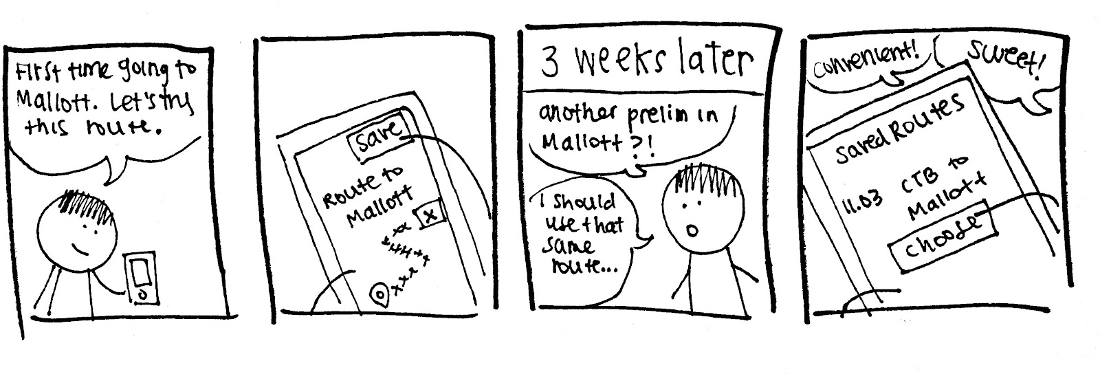
- An application that will record the paths you take, and allow the user to easily go back to a path that has already been taken
These themes were illustrated with storyboards, which helped to put them in the context of our personas (scroll to view):


Paper Prototype
After critiquing each others’ ideas, we came up with a paper prototype (scroll to view):
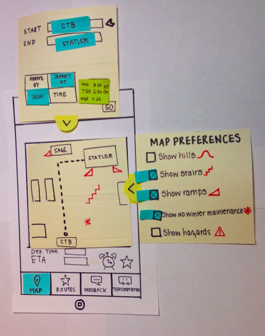


Each page addressed different aspects of our primary and secondary personas. Following this, our prototype was uploaded into InVision to allow for more realistic interactions, viewable here.
Heuristic Evaluation
Individually, each group member conducted a heuristic evaluation of our paper prototype, including the violated heuristic, location, and problem description. We then combined these into one large spreadsheet and rated each problem on its severity. We discussed different solutions for each violated heuristic, until we were able to agree on a solution we thought best fit the problem at hand.
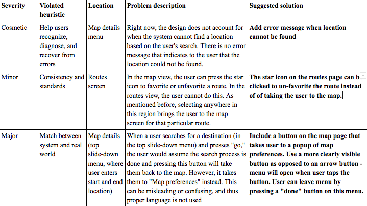
Example of heuristic evaluation chart.
Based on this information, we were able to develop a more comprehensive high-fidelity prototype. This was also integrated into InVision, viewable here.
Evaluation: INTERVIEW II
After improving our prototype, we designed a new interview protocol that would take place with our high fidelity prototype. We wanted to see how much ease the participant had in fulfilling these tasks, and if they came across any difficulties when using the app. The feedback from the participants’ interactions with these evaluation tasks gave us insight that allowed us to modify our final design. During the interview, we asked users to “think out loud,” as we wanted participants to explain what they were doing and why. This allowed us to learn more about how users were interacting with our application in real time.
Improved Design
We gathered “critical incidents” from our interviews and compiled these into a list of UX problem instances.
Our top three problem groups (and subsequent design solutions) were as follows. Our final high-fidelity prototype can be found here.
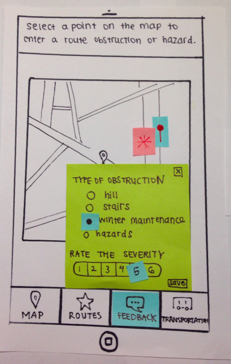
1) The “Feedback” page is too isolated and non-intuitive to find: Users had considerable difficulty locating the “Feedback” page and reporting feedback on a particular location. Many users tried to report feedback via the “Map” page.
Solution: In order to make the feedback functionality more accessible and salient, we integrated “Feedback” into the “Map” page. Users can report feedback via the “Map” page by selecting a point on the map.

Alternatively, users can search for a destination and then report feedback on that destination.

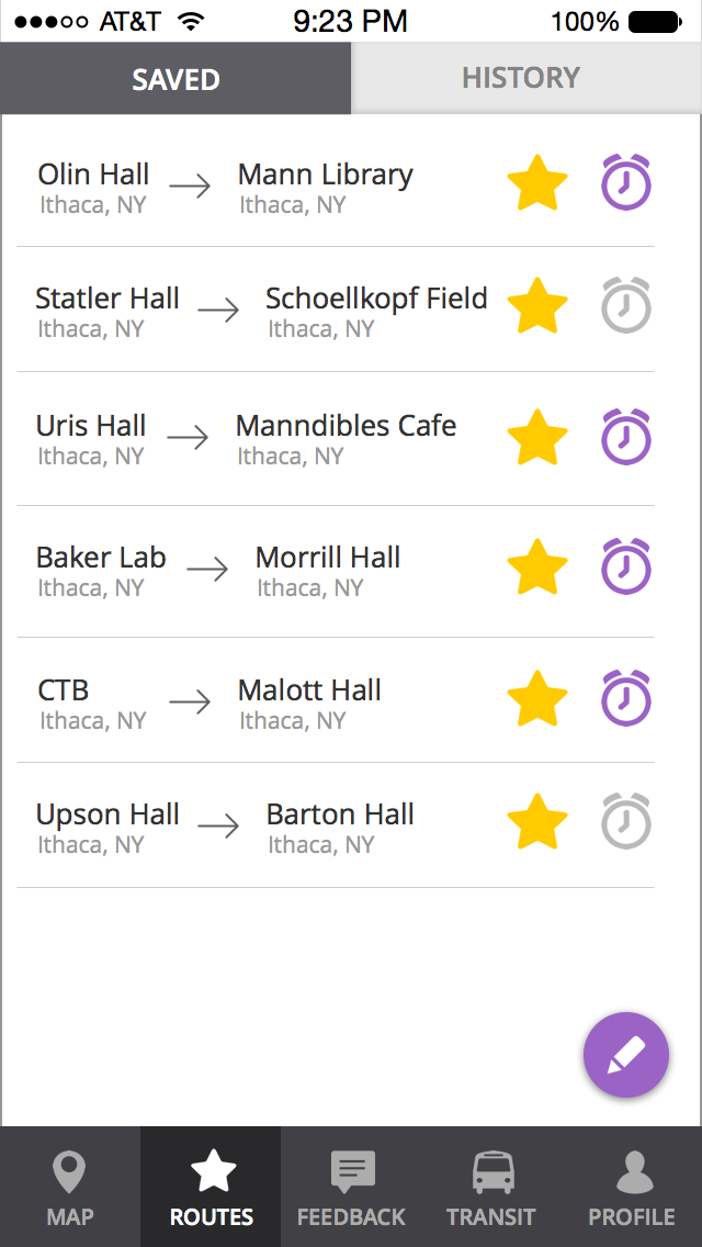
2) The design of the “Routes” screen leads users to have varied expectations on how to “unsave” a route: Users often tried to unsave routes in a variety of ways because of the conflicting signals given by our prototype.
Solution: We removed the icons on the “Routes” page, as users were not interacting with these icons and they only seemed to add to their confusion.
Old Prototype:
New Prototype:

Furthermore, most users assumed that routes could be edited and un-saved by clicking the purple pencil icon at the bottom right of the screen. So, we expanded upon this functionality so that users can now edit, delete, or rearrange saved routes after clicking this icon.

3) Adjusting “Map Preferences” is not a visible feature on the map page: Users can adjust which obstructions show up on the map through the “Map Preferences” menu, which was originally accessed via an icon on the “Map” page. However, many users did not know how to find this “Map Preferences” menu, as there was not a clear natural mapping.
Solution: We implemented a solution that makes this button more salient and the menu more accessible. We changed the design of the button to make it more visible. Now, the button has the words “Map Preferences” in addition to the icon. This button is present on any “Map” page.
Old Prototype
New Prototype

By adding these improvements to our design, it was our hope that our app would be more user-friendly, providing users with a more enjoyable experience characterized by intuitive action and ease-of-use.
Final Thoughts & Contributions
This project helped to introduce me to the user-centered design process, and the importance of continually iterating through prototypes rather than simply sticking with initial designs. By speaking with end users and better understanding their wants and needs, we were able to create a solution that specifically targeted some of their key pain points. In addition, by conducting usability tests and heuristic evaluations, we were able to see where our app failed to match users’ mental models, and consequently improve our design.
Throughout the process, I assisted in coming up with design ideas, and attending/analyzing interviews. I also helped write, format, and proof-read the various milestones to be submitted. I worked on creating the initial paper prototypes we used, and later helped to link our high-fidelity prototype on InVision, among other things. This project made me realize how lively and creative user experience work can be!
︎︎
Computer Mediated Communication:
Investigating Self-Disclosure
Communications research examining self-disclosure patterns on
video conferencing and instant messaging platforms
Purpose
This project was conducted as part of a course on Computer-Mediated Communications (CMC), taken Spring 2017. Throughout the semester, my teammates Greg, Haewon, Olivia, Sloane and I sought to examine self-disclosure patterns on CMC platforms, defining self-disclosure as a communicative process in which a person shares potentially private information about themself to another person. Our study aimed to examine how people self-disclose information to strangers using different forms of CMC, includng an instant messaging and video conferencing platform.
Research Questions & Hypotheses
When creating our study, we were interested in using our topic of study to further examine the following research question: Do people engage more in self-disclosure during video-based conversations or text-based conversations? At the outset, we developed our first hypothesis H1: People are more likely to self-disclose information about themselves over a video conferencing platform as opposed to an instant messaging platform. Video conferencing lacks affordances like revisability and reviewability; as such, participants may be more likely to quickly respond to questions and then expand upon their answers as part of the natural progression of their dialogue.
In seeking to understand the difference in levels of self-disclosure across these platforms, we conducted in-person experiments. Each experiment asked the participant personal questions relating to money or school. In order to gauge the conditions and questions most likely to affect self-disclosure, each question had differing levels of intensity. While creating these experimental conditions, we developed our second hypothesis H2: In both video conferencing and instant messaging environments, participants are more likely to self-disclose. Because these questions are inherently less-risky, we hypothesized that participants would be more likely to elaborate in their responses.
In addition, we wanted to examine the sentiment of statements made by participants. This led us to develop our second research question: Do people make more positive or negative sentiments when disclosing information about themselves during video-based conversations or text-based conversations? Based on this, we came up with our third hypothesis H3: people are more likely to make fewer negative sentiments over a video conferencing platform than an instant messaging platform. Due to a lack of physical presence and visibility, people may be more comfortable sharing negative information over instant messaging.
Conducting literature reviews throughout this ideation phase also helped to inform our hypotheses. However, many of previously-conducted experiments were done as a comparison between CMC and FtF (Face-to-Face) interactions. In order to delve further into CMC specifically, we decided to look at how levels of self-disclosure may in fact differ across various online platforms, particularly instant messaging and video conferencing platforms, as each of these present a diversity of affordances. We believed that these two forms of communication were unique enough to reveal differences in levels of self-disclosure.
Experiment Overview
In order to test our hypotheses above, we conducted an interview-based experiment with ten students at Cornell University (nine undergraduate students, and one graduate student). Participants engaged in two different interviews with a confederate. We used this to see whether or not levels of self-disclosure differed as a result of different CMC mediums.
We created two questionnaires, one for each interview. The first questionnaire asked participants about their relationship with money and the second asked about how a participant was doing in school. We categorized the questions based on how invasive they were. Both questionnaires consisted of ten questions: three mild intensity questions, five medium intensity questions, and two high intensity questions.
When participants arrived, they were asked to read and sign our consent form before they were eligible to begin the experiment. Participants were told they were taking part in a Video Conferencing and Instant Messaging experiment and that they would have two interviews with strangers, one on each medium. Participants were in a separate room from the confederate, using Google Hangouts for each interview. Each participant was randomly assigned one of the two topics for each type of interview (text messaging or video conferencing). The order of each type of interview was also randomized. Participants were told they could either answer a question or simply say ‘pass.’
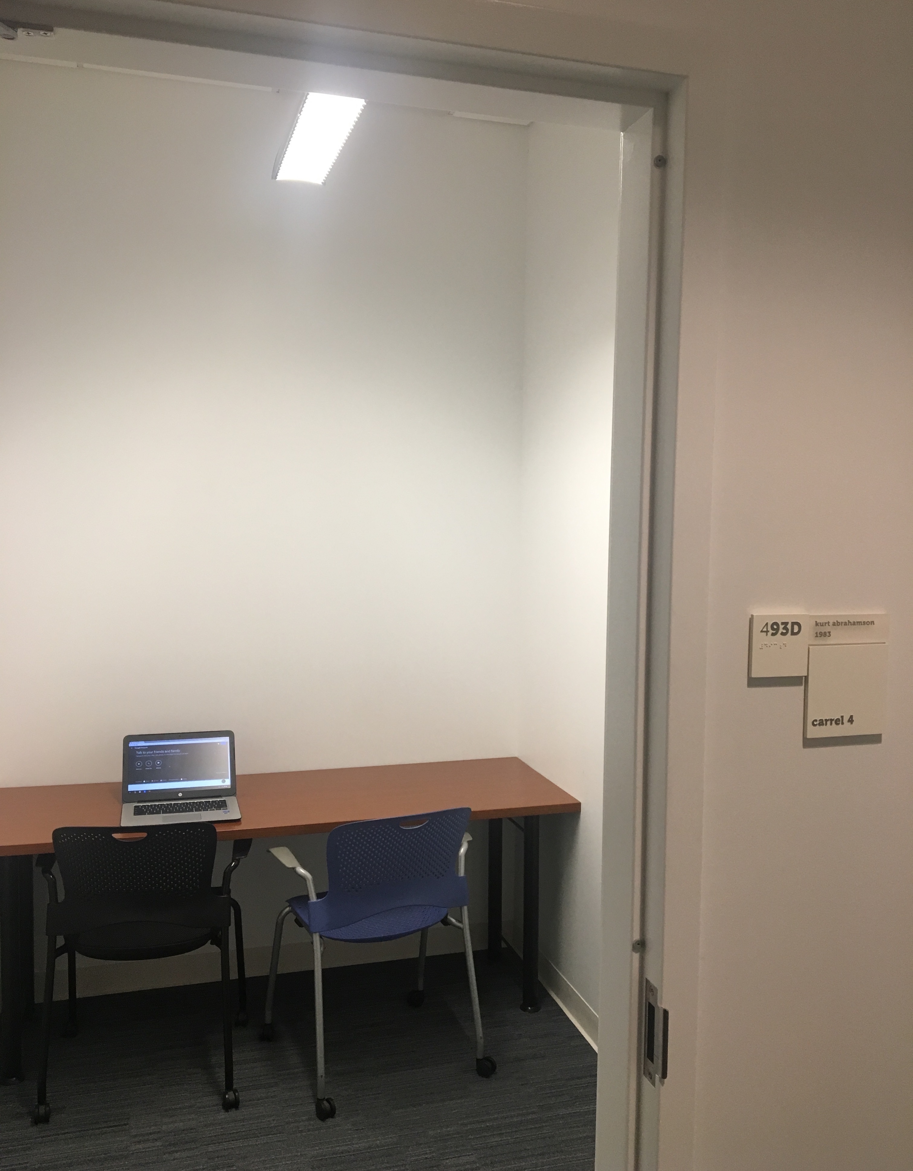
Study room used by participants
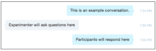
Example of text-messaging
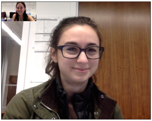
Example of video-conferencing (Sloane & Me)
After completing both interviews in a random order with a random topic, users were asked to complete a post-survey. Participants were then debriefed and the experiment was completed.
Experiment Results
In order to assess levels of self-disclosure by participants, we utilized a word count method. Word count was used to determine differences in levels of self-disclosure between video conferencing and instant messaging. It was also used to look at the differences in self-disclosure for questions of varying intensity. We also conducted a sentiment analysis, and analyzed the results of the post-survey. Conducting a word count of our participants’ interviews first involved transcribing the audio of those interviews held over the video conferencing medium. After all interviews had been transcribed they were further examined, during which time interjections by participants, including words such as “uh,” or “um,” were removed. We also removed any response by a participant requesting that the question be passed, as this was a right given to participants upon consenting to partake in our study. Once each interview had been amended to meet these specifications, a count of the remaining words was conducted and averaged.
The average number of words disclosed by participants over video conferencing was 234.9. The average number of words disclosed by participants over instant messaging was 176.2 . This supports H1, that participants are more likely to self-disclose over video conferencing than they are over instant messaging.

Total average word count on each medium.

The total average word count per one question of each level of intensity, on each medium (instant messaging in red, video conferencing in blue).
In addition to measuring word count disclosed by participants over video conferencing and instant messaging, we also analyzed a smaller subset of questions in order to determine the presence of a relationship between question intensity and levels of self-disclosure. For each set of interview questions (money or school) we chose a question of mild, medium, and high intensity. We then went back through each interview, and recorded the word count of participants as they responded to each question type in both mediums. We then averaged these results across all participants in order to gauge how questions of differing intensity levels impacted levels of subsequent self-disclosure. The data collected supports H2: in each platform participants are more likely to self-disclose information in response to mild intensity questions over medium or high intensity questions. This information is also in line with H1, as for each level of intensity self-disclosure was always greater in the video conferencing platform than it was in the text messaging platform.
Just as important as the number of words a participant emits is the content of what they say . On the highest level, we wanted to measure how positive or negative a user’s responses were between instant messaging and video conferencing. Using sentiment analysis in order to analyze sentence construction and vocabulary, we were able to scale each participant’s responses to a +1.0 and -1.0 range. Each sentence was analyzed using the popular Text Blob library in Python to conduct the analysis. After conducting this analysis, we found that there were a total of 5 instances of negative sentiments in instant messaging, and 9 instances of negative sentiments in video conferencing. As a result, this information rejects H3, as people are more likely to make more negative sentiments over a video conferencing platform than they are over an instant messaging platform.
Post-Survey Results
Despite the data showing that our participants disclosed more on video conferencing than on instant messaging, post-experiment Qualtrics survey results show that the majority of the participants felt more comfortable self-disclosing over instant messaging. The participants were asked to self-evaluate their behavior after the two conversations, and 60% of participants stated to have felt more comfortable disclosing information via instant messaging. Some stated reasons for this sentiment include that the participant could revise their answers, had more time to think of the right way to phrase thoughts and responses, felt safer without eye contact, and felt more anonymous and could therefore say anything they wanted.

Post-survey results: Do you feel more comfortable disclosing information via text (top) or video (bottom).
Discussion & Conclusion
Throughout this study, we sought to explore the behaviors surrounding self-disclosure on two different CMC platforms: instant messaging and video conferencing. By observing our filtered data in conjunction with the other statistical data mentioned above, we discovered some interesting points that either confirmed or rejected our hypotheses, as well as afforded new insights into the nature of self-disclosure. The data clearly shows that individuals are more likely to self-disclose information over a video medium. Across all intensity levels, average word count was significantly higher over video than text. Upon further inspection, the most words disclosed across any interaction type and intensity level are mild questions over a video medium. Consequently, our results supported our first two hypotheses in that participants were more likely to self-disclose over video conferencing rather than instant messaging and that regardless of platform, participants were likely to disclose more for mild intensity questions over medium and high intensity ones. Nevertheless, our third hypothesis was unsupported, as participants had more negative conversations during the video conferencing interview than instant messaging interview.
Potential explanations of this observed result are that the pure nature of FtF interaction, even over video conferencing, reduces the amount of time to prepare a statement than text. The unconscious necessity to respond quickly drives individuals to immediately emit words, despite the fact that they typically are emitted unnecessarily or in a verbose manner.
As we conducted the sentiment analysis on each user’s sentences, the results surprised us. We found that there were only 5 instances of a negative response in instant messaging, and 9 instances of a negative response in video conferencing. We theorize that possible reasons for this increase in negativity is due to an increased sense of ambiguity and misunderstanding over video rather than chat. Given our data, it seems as though people feel less inclined to show their negative opinions over text with a complete stranger. This kind of insight can be observed in the real world in instances where people are soliciting others, such as a job application, or even a Tinder profile. Although it is deceitful, people would still rather hide their negativity until they are face to face.
While our study led to some interesting discoveries, there were some clear limitations that could have inhibited our experiment. For example, given the limitations of time for our experiment, we were only able to achieve 10 participants. Another limitation of our study was in the nature of what we deemed mild, medium and high intensity level questions. We created and categorized questions using our own subjective opinions. It is possible that by changing the questions, the results could change as well. For future studies, a survey could be sent out prior to the study asking participants (separate from the actual experiment) to rate several questions from mild to high intensity, thus quantifying an otherwise moralistic quality.
Final Thoughts & Contributions
This study was important because it taught me to realize how critical a platform can be in impacting how a user interacts with others. Not only that, different forms of CMC can also cause people to feel more or less comfortable. In the case of this study, although the video-conferencing and instant-messaging platforms used both existed in an online environment, they still managed to elicit different responses from users, including not only how much users responded but also how they responded (sentiment). In addition, users perceptions and real-world actions did not always align, which marks the importance of using various methods of experimentation to better understand how users operate. Various forms of CMC can bring with them diverse sets of etiquette and norms, which may ultimately alter the user experience, and as such should be seriously considered in the design of new applications and programs.
Throughout this study I helped conduct initial research, design the study, and write our final report. I participated in many of the studies, as both the research assistant and confederate. I also assisted in transcribing audio, and organizing/analyzing the results of the study, specifically gathering word counts per participant and per question intensity.
︎︎
Carat Intern Project:
Understanding the Hispanic Consumer
Research focused on ways our client could target Hispanic consumers using a more audience-based approach
Purpose, Roles & Research
This research was conducted as part of an intern project for Carat USA, a global media company I interned at during Summer 2016. Working with six of my fellow interns, our task was to conduct a deep-dive into the lives of the Hispanic Consumer for a home improvement and construction store. Because the Hispanic Demographic was a key component of their consumer base, it was our job to do further research into the lives and technology habits of Hispanic Americans in order to better understand how to capture their demographic.
In order to conduct effective research, we first split up the various categories of research per team member. Areas of research included things like:
• Basic demographic information: Interests, Activities, and Mindsets
• Target information: Media Habits
• Target information: Purchasing Behavior
• Trends
• Case studies
We planned to gather a combination of both broad and specific information, as this would allow us to have a more well-rounded sense of understanding regarding our consumers. We could then specifiy this information in greater detail, pulling from our insights and using case studies to come up with informed recommendations.
Because of my interests in technology use, I conducted research on the media habits of Hispanic consumers. I found information regarding the media habits of the general US Hispanic population, including the devices they typically use and how they use them. Using key resources like Nielsen, Mintel, MediaPost, and eMarketer, I was able to gather useful insights and report back to my colleagues.
Initial Demographic Findings & The Hispanic Consumer
After we had conducted research, we met as a team to go over our findings and begin compiling our information into a slide deck we could present to our client’s Media Director. We found that the Hispanic population is diverse, and the term itself can account for a large population of people.
The importance of culture was also a prominent theme throughout our research. Hispanics come from a wide array of countries and have much pride for their country of origin. The term Hispanic is very general, and Hispanic people may instead refer to their specific home countries more because they personally resonate. Noting this difference is important.
We also found that while 2nd generation Hispanics may be bilingual, they are consuming most media in English. However, this does not mean that they are not also proud of their culture, which was an important finding to note. Language and culture are not necessarily interchangeable. Their values are a blend of both cultures, something we deemed “200%: 100% American, 100% Hispanic”.
Media Behavior & Habits
The research I conducted and presented was in regards to the media behavior and habits of the hispanic consumer. Through this research, we found that Hispanics are prominent smartphone users compared to other minorities and total users, and a substantial portion of Hispanics are also tablet users.
In addition to these handheld devices however, it was also important to consider traditional channels like TV. TV is largely popular amongst Hispanics. Nevertheless, it was useful to note that whereas monthly time spent watching TV decreased slightly from 2014 to 2015, video viewing on PCs and smartphones increased slightly. Both mediums are therefore important: TV because of its large popularity, and PC/Smartphone because of their growing potential as ways to consume video.
Consequently, Hispanics are not only consuming more video, but they are also doing it across more platforms. These platforms are key because of they can increase the range of content offered, including niche topics like foreign or international news. These are topics Hispanics are specifically seeking out. As an example of this, Hispanic Millennials often turn to YouTube to get news, which is a bit unconventional but highlights the versatility held by these such platforms and why it is important to keep them in mind in planning.
In addition to this, Hispanics often use social media to connect with both their family and peers, and they do this through personalized, specifically visual content that they can create themselves and which caters to their own demographic.
Purchasing Behavior & SWOT Analysis
Following this, research was conducted on the purchasing behavior of Hispanics. We found that Hispanics research and purchase across laptops/PCs, smartphones, and tablets. Laptop/PCs are their primary device for research and purchase but they are also more likely to use smartphone and tablets when compared to the general population.
After our research had been conducted, we look at our client’s current status in targeting the Hispanic Consumer. The client currently works off a departmental system rather than audience based, although they do have bilingual signage and staff, a Hispanic YouTube account organized by season and type of project, and directly translate General Market ads to Spanish. Further points conducted as part of our SWOT analysis include examples such as:
• Strengths: YouTube channel exceeds competitors; strong overall brand name
• Weaknesses: Hispanic website closed due to low traffic; lack of Hispanic values and culture in advertisements
• Opporunities: Bilingualapproach to ads; organizing the youtube channel by cultural events, Facebook page in Spanish; update website to include some Spanish translations; host in-store bilingual DIY workshops to get customers in-store.
• Threats: Direct competitors; smaller, more hispanic friendly brands
Final Recommendations
After combining all our research, we were able to come up with slide deck of information that we presented, which included a set of final recommendations and supporting strategies. Our main recommendation was to follow a total market approach: First, looking at how general market approaches reach the Hispanic consumer, and then understanding how to further reach out beyond this to fill gaps where Hispanic consumers exist.
By finding pockets where the demographic was not being reached, Hispanic-specific ads and strategies could be implemeneted that would help to build brand love (for example, introducing ads focused on culture rather than price points). Other ways to fill the gap included things allocating more money towards search and mobile; targeting the younger Hispanic demographic as they are a large group of future consumers; and focusing more on the DIY aspect of home improvement.
Challenges
One of the main challenges I faced personally throughout this project was learning how to create effective slides that could convey key points to the audience without overburdening them with information. I was able to learn a lot after speaking with one of my bosses and mentors, Jason. In this case, he explained to me how slides should be used to complement the story that you’re trying to tell, and as a result they shouldn’t be burdened with telling the entire narrative.
Taking his advice, I was able to update my slides so that they were more aesthetically pleasing, and more effective in presenting information to the audience. Taking a step back and understanding just what it was I was trying to convey to the audience allowed me to make my slides more concise.
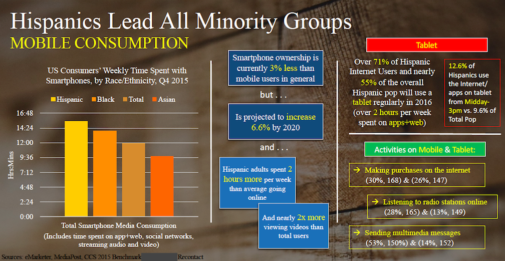 Before: Lots of facts and figures crowd the page. The sheer amount of text is overwhelming.
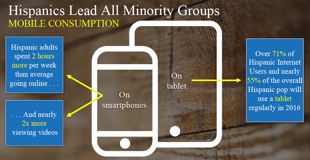 After: Information is clear and easy to differentiate. The point comes across easily.
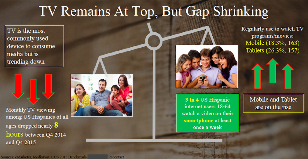
Before: Graphics are misleading. “TV Remains at Top” contradicts down tilting scale.

After: Graphs portray TV’s slight decline from 2014-2015, but still illustrate its dominance.
Final Thoughts & Contributions
This project was important because it taught me how to look at a specific user group through research and data. By looking at various graphs and reports, I was able to learn more about the media habits of Hispanic consumers. This information could be used in the future to create ads that tailor to the Hispanic demographic’s user experience.
In addition, because of this project I was also able to improve my presentation skills. By making my slides more to-the-point, I was able to increase the likelihood that my audience members would actually be able to read what was being presented to them, and understand why the data mattered in the context of the larger point I was trying to make.
Cargo Collective 2017